Hoping the Warm Toned Trend Dies Out…

hey everyone!

I’m back and while I won’t be posting frequently, this IS a hobby that I enjoy and that I missed. I had some big life changes happen and now I’m ready to make more time for myself again!

But while I was gone… something happened. Warm. Toned. Palettes.

Everywhere.

From every brand.

Can someone please explain to me and the rest of the VERY cool toned beauty junkies out there what is the driving force behind the warm toned epidemic?


heat1.jpg

photo via UrbanDecay.com

The newest addition is Naked Heat… but did we REALLY need it? I love urban Decay. I love their shadow formula especially and was waiting and hoping for another naked palette. Then they released this. I feel like this missed the boat on the trend (I’m hoping now we are in the tail end of warm everything).

Where is my cooler toned, purple or green shades to go along with the Naked 2? That is by FAR my favorite Naked palette specifically because of the cooler toned, taupey shades.

ana1

photo via AnastasiaBeverlyHills.com

Then there’s the one that seems to have started it all. She may look a little different in this post, but this is the ABH Modern Renaissance Palette. I love some of the berry tones in this palette. They also came out on the forefront of this trend so this one I think is 100% unique for when it came out.

But then we got so many similar palettes trying to capitalize on the trend that they are redundant now. Huda Beauty Rose Gold Palette. Natasha Denona Sunset Palette. Naked Heat. Just to name a (very) few.

I am hoping that Naked Heat is the beginning of the end or a nail in the coffin for this trend. Hopefully as we see less summer releases and start transitioning into fall, we will see more cool tones and then I can start making posts about the stupid amount of purpley taupe palettes I’m buying instead of basically and anti-haul.


Thank you for those that come back after my absense.


With love,

A

VS: Urban Decay Heavy Metal Glitter Liner VS bh Cosmetics Glitter Eyeliner

Hello lovelies!


I love wearing glitter liner whenever I can think of an excuse to. I recently bought some from bh Cosmetics (part of my first purchase from the brand). When I unboxed them I thought that the packaging looked very similar to the Heavy Metal Glitter Eyeliners I have from Urban Decay.

I test drove the bh version on New Year’s Eve so that I could compare them for you here!


bh liners in Synergy and Rapture.


Urban Decay liners in Spandex, ACDC, and limited edition Gunmetal.


Packaging:

As I said, the packaging on both is very similar. They both have wand applicators with small brushes. The bh brushes are a touch larger which I actually prefer as they pick up more product, making the application easier.

The bh liners are .15 fl oz while the UD ones are .25 so you get more products from Urban Decay. The packages also indicate that the shelf life on the UD product is 4 times longer than the bh glitter liners (24 months vs 6).


from L to R: bh Synergy, bh Rapture, UD Spandex, UD ACDC, and UD Gunmetal


Wearability:

UD in the past has transferred easier than the bh version did. I have hooded lids, so I got some transfer onto my crease. I set them both with the same setting spray, so the application was consistent from time to time.

As I said above, the bh version applied more smoothly and I feel like it was MUCH faster than when I applied the UD ones. With the UD formula and applicator, I had to dip the brush into the product constantly and go over the same line multiple times to get what I wanted.

The glitter in the UD liners is finer, which I would expect being from a higher end brand. Typically these finer glitters are safer for the eye and meant for cosmetic use. However, the effect of the larger glitter is more intense and therefore more appealing to me as I wear glitter liners mostly on nights out when I want it to be a very noticeable ‘pop’ and different from my normal routine.

The shade ranges from both brands are very similar. UD offers 7 shades while bh offers 5. Both offer forms of opalescent, silver, pink, and blue. bh additionally offers green while UD offers gold, purple, turquoise and some limited edition shades such as gunmetal which is silver and black glitter (from the Pulp Fiction line).


Price:

Urban Decay heavy Metal Glitter Eyeliners run $20 each. You can occasionally get them for 20% off from Ulta of directly from the Urban Decay website.

bh Cosmetics Glitter Eyeliners retail for $8 but are regularly on sale for lower. At the time of writing this blog, they are up on their site for $5.


Verdict:

I usually like to buy higher end brands because I find the quality, performance, and wear time to outperform the lower end competitor. That is clearly not the case here. While I still love the Heavy Metal liners, the bh cosmetics liners perform just as well (if not better) and you just can’t beat the price point! If you are not worried about the larger glitter and shorter shelf life, I would check out bh!!


-A

Rant: Why I Left Sephora During My Time MIA

Hello loves,

It has been awhile, but I’m back! A lot happened during this last year that kept me VERY busy. I got promoted twice, moved, and am in progress f getting my anxiety and depression back on track. That was honestly a major reason for my hiatus. I enjoy reviewing for you all and I love makeup… but my anxiety about feeling like I HAD to post or I was failing took a lot of the enjoyment out of it for me to be blunt.

Now I’m back on track and LOVING it again, and I hope that my renewed love will show through my reviews even though tone is hard to convey through writing!

NOW THAT THAT IS OUT OF THE WAY, let’s get to what you all are here for: Why Ulta is awesome and why I’m over Sephora.

There was no single incident that made me go,’Hmm I think I’m going to switch over’. It seemed to be a more gradual shift in my shopping habits. I used to be a die hard Sephora customer. I posted raves like this.

Part of the issue is the attitudes of the sales associates at each given store. While Sephora is nice enough, they always seem to have this elitist attitude and look at me like I don’t belong there. Ulta associates aren’t as knowledgeable in general about the product features and benefits, but I usually know what I want and they are more than willing to help me locate it.

I started to realize that if I could buy items at either store (my favorite brand is Urban Decay which is available at both stores), that I switched to Ulta for their rewards program. At Sephora, you save up points to get deluxe samples… I finally figured out that I either A) was never excited by the samples that were available B) Could have gotten those samples for free from stopping in the store in person and asking or C) had to spend $150 to get a tiny mini thing that usually gets me two uses.

At Ulta, they reward my obsession with money off… meaning more FULL SIZE, ACTUAL product to obsess over. They drive my addiction, but they also reward me for loyalty to them when I am planning on buying everything anyway. As a Platinum member, they are constantly sending me emails for 5x or 3x points, and at a minimum its 1.25 points per dollar that I spend. I also visit the Salon at Ult, and get points for this as well.

They also reward me for being a hoarder. I currently have hoarded enough points for $70 off… A few more points and I get $125 off a purchase! The more you save your points, the more cah value they end up having!

The other main thing that I realized is that it seems like Ulta has worked out partnerships with brands that benefit the consumer more. For instance, I almost ALWAYS get additional free samples when I order UD from Ulta, unlike Sephora where I just get what I paid for.

I will post an example in the next few days of one instance where I got a HUGE bag of free stuff from Ulta, and money off and how it kicked my Sephora free stuff haul in the ass.

Til next time,

A

Review: Lorac Mega PRO Palette

Hey guys!


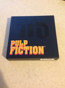
As you all know the holidays are coming up. If you missed the Lorac Mega Pro palette, people are still putting them up on ebay. If you start watching now, I’m sure you can find one at a reasonable price. However, this item was a Limited Edition from Lorac and Amazon, so it is not available through the official retailers anymore.

I figured I would still do a quick review though in case anyone was debating buying themselves a little something, or putting one of these babies on their Christmas list!

lorac3a

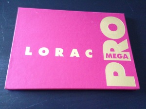
The palette itself is quite a bit smaller than I had anticipated it being. It was roughly the size of the Vice palettes from Urban Decay but thinner. It is a sturdy cardboard, and the top portion can be flipped all the way back. It also has a good sized mirror. It might be a little bit big for travel if you are taking a shorter trip.


lorac1


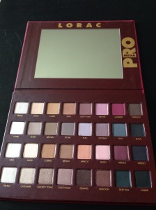
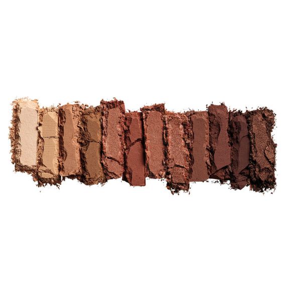
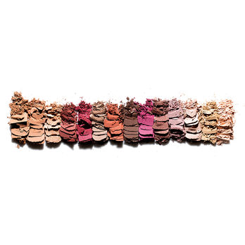
Here is a closer photo of the shades and layout of the palette. The top half is predominantly matte shades, although the 2nd row is more of satin than true mattes. The bottom half is very similar but has much more shimmer. I feel like the first two rows could be laid over the bottom two and you would have almost the same colors in matte and shimmer in most cases (see Mulberry and Merlot). There is, however, still some variation and I do like that I can use this to add drama with the bottom half or keep simple and clean daytime looks with the upper half.
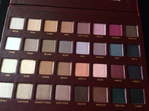
lorac2

Shades in order

Row 1: Cream, Fawn, Camel, Sepia, Dusty Plum, Orchid, Mulberry, Espresso

Row 2: White, Khaki, Brown, Stone, Lilac, Wisteria, Gray, Black

Row 3: Opal, Sand, Copper, Sienna, Apricot, Blush, Merlot, Indigo

Row 4: Vanilla, Cashmere, Smokey Topaz, Dusty Rose, Granite, Maroon, Deep Teal, Caviar


Swatches:


lorac8

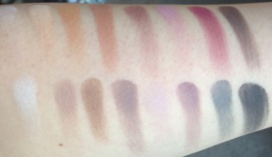
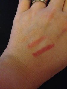
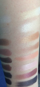
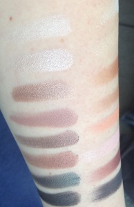
Swatches of Row 1 and 2 in order. On bare skin in natural light. Row 1: Cream, Fawn, Camel, Sepia, Dusty Plum, Orchid, Mulberry, Espresso Row 2: White, Khaki, Brown, Stone, Lilac, Wisteria, Gray, Black

Cream is a pale warm beige. Nothing too crazy, would be a good highlight for someone with a bit deeper skin tone.

Fawn is  a warm peachy beige.

Camel is just as it sounds, a tan (camel-y) color.

Sepia is a brown with warm undertones. It is more of a medium shade and has better color payoff than the Camel or Fawn.

Dusty Plum is muted plum. I wish it was a cool shade but sadly is a warm tone (but still lovely).

Orchid is a pinky shade. Finally a cool toned shade, but I’m not a huge lover of pinks so even though this one is a purpley pink, it is one that likely won’t see much love from me.

Mulberry is cool tone berry. This one can have some problems with dragging/blending so you need to have a little more time to work with this one and I would REALLY suggest using a primer!

Espresso is dark brown. Nothing too crazy, but I do like this one for the outer corners when I am doing a softer daytime look.

White is plain white. This one is kind of chalky and I probably won’t use this one a ton.

Khaki is a grayish brown. I like the slightly satiny finish to this one.

Brown is a matte medium brown. Another staple shade that you probably already own in a few variations, but it’s nice to have it easily accessible for when you are creating a look with this palette.

Stone is a purpley gray. This is one of my favorite shades in the palette after actually using it a few times. The purple tones to it make it more interesting than a lot of the other gray shades in my collection.

Lilac is lavender. This one was chalky and did not have very good color payoff at all. My least favorite out of the whole palette.

Wisteria is about the opposite of stone. This one is a purple with a bit of gray added. I like to use these two to create just a bit of contrast but stil have a very subtle day look.

Gray is not gray. I’m not really sure why they even called it that. If anything, stone is more of a gray than this is. This is more of a blue. It’s a grayish blue, but still.

Black is a plain matte black. Again chances are you already have this in your collection, but it comes off more of a charcoal than a true black. I also had some issues with blending with this one.


Let’s move on to the next 2 rows! The shimmers!


These are the shimmers. I took 2 photos under each lighting with my arm turned, in order for you to fully see each swatch. These are taken in soft indoor lighting with no primer. I tried to make one set of swatches the focal point of each photo. The ones that are complete swatches (not cut off at the ends) are the focus of each photo.

lorac14lorac13


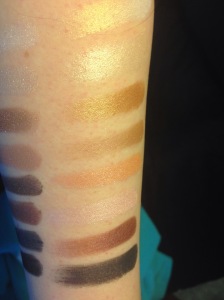
Swatches of Row 3 under natural light and indoor lighting.

Row 3: Opal, Sand, Copper, Sienna, Apricot, Blush, Merlot, Indigo 


Opal is much prettier than I had thought it would be judging from the pan. It is a white with intense gold shimmer.

Sand is a light champagne. I reach for this one quite a bit as a highlight.

Copper is a metallic-y reddish brown shade.

Sienna is a softer brown. Another good one just to have if you are looking for a little something without going too over the top.

Apricot is bright peachy orange. It was MUCH brighter swatched than I thought it would be and would really help to brighten a look.

Blush is a light frosty pink. It wasn’t as buttery as some of the other shads.

Merlot is my FAVORITE shade in the bunch. Its a medium metallic wine shade with a bit of shimmer. Goes on very easily and blends well.

Indigo is blue black with a ton of micro glitter, but the glitter is VERY hard to see once applied.  With a more intense (sticky) primer, the glitter may take hold better and be more visible, which would make this another favorite.


lorac17lorac12


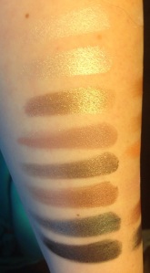
Row 4 under natural light and indoor lighting.

Vanilla, Cashmere, Smokey Topaz, Dusty Rose, Granite, Maroon, Deep Teal, Caviar


Vanilla is more frosted off white. This is another I prefer to use for a highlight or the inner corners.

Cashmere is a softer metallic light tan/off white. I use this on my brow bone when I want something with a hint of shimmer but not a ton of color, but the light color would show on someone with a darker complexion.

Smokey Topaz is bronzy brown with a bit of glitter and is pretty pigmented.

Dusty Rose is brownish pink. Another shade you may already own.

Granite is another frequently used shad for me. Dark brown with some shimmer/metallic finish that is super easy to blend and work with.

Maroon is brownish red. I was hoping with would be a deeper TRUE maroon (a bit closer to the merlot), but its more of a red.

Deep Teal is another beautiful shade. It’s a darkened cool teal. This is one of the shades that initially interested me and it did not disappoint.

Caviar is more of a true black than the ‘Black’ shade in this palette. It is not matte, but when I want a black, I reach for this.


Overall, I would absolutely buy this palette again. It was $59 and while I do wish more shades were cool toned, but I find that the warm shades here are still okay for me to work with.  It does have quite a few browns and whites, but on the skin they are all different enough where I was not disappointed, and there are enough unique shades that I would have gladly paid more for to make this palette worth it for me!


Review: MAC Rocky Horror Picture Show Collection

Hey guys!


A few weeks ago, I stayed up in great anticipation to grab some items from the MAC Rocky Horror Picture Show collection!


I changed my mind about 15 times as to what items I was going to grab. It didn’t help too that the launch was plague with issues. MAC was supposed to release this collection on Sept 29th. Then word on the internet was that it wouldn’t be out until the 30th (so some people wound up staying up 2 nights in a row). Then MAC tweeted a statement saying it would be out around noon. They missed this deadline as well and when the collection finally launched, they were missing one of the most anticipated items – Frank-N-Furter lipstick. Rumor on the street is that there was a problem with one of the FNF batches, which is why the entire collection was delayed.

Anyway, once I was FINALLY able to place my order, I went as quickly as I could. This was no time to look around. I felt like I was that crazy person during Black Friday that just throws EVERYTHING in their cart and runs to the register. lol.


The packaging on all of the items that I got is amazing! The picture below is of the inside of the blush box, but they all have this image of the characters inside!

IMG_2387


I grabbed the Crazed Imagination limited edition blush because it was a pretty purpley-bronze shade on my monitor. When I swatched this, I was VERY disappointed. I was aware that it was sheertone but there is literally almost NO coor payoff on these, even though I am super pale. It was also more on the brown/bronze side than I had been hoping for.

Oct10


My sister and I happened to stop at a MAC store the day of the in-store release and while I was there I showed her how poor the pigmentation was. The sales woman snarkily told me (because I had just swatched it with my finger and got nothing as far as color payoff) that since people had been rubbing their fingers all over it all day that of course it wouldn’t have any payoff since the oils from everyones hands were all over it. I understand this may be somewhat true, but I replied back that even my BRAND NEW item that I was shipped had poor payoff as well and I walked away. I was a bit irked by it however.

Moving on, the next item was the pigment. This shade was another limited edition shade called ‘It’s Not Easy Having a Good Time’. Again, I’m not sure if I have a monitor issue or not, but this looked like a beautiful plum with a bronze shift. This turned out to be a bronze with a reddish shift. Not bad, but also not something   I was crazy for or would use all the time like I would have had it been the shade I thought it was!

Oct12

I grabbed some of the blue base red lipsticks since I have pink undertones. The first is ‘Oblivion’ which is very bright and has an almost satiny finish.

RH2

Next is ‘Frank-N-Furter’ which is the one that was much waited on and had the potentially botched batch haha.

This one is a pretty matte and looks like a great go-to fall blue red.

RH3

The Formidable nail polish was the one item that I got because the histeria, lack of sleep, and the craziness of the sale got the best of me. I paniched and picked the shade I liked better, only to find out right after I placed my order that this color in particular is part of their permanent collection and was just shown in the fancu packaging. The only other polish shade was one that was a repromote or limited edition so Bad Fairy is the one that I left behind in the chaos.

IMG_2391


The products are all the same quality that we have come to know and love from MAC. I also love that the RHPS graphics on the packaging are on there really well. They aren’t like a cheap sticker that is very easy to scratch off.

Below are some swatches of a few of the items. We have Frank-N-Furter at the top, Oblivion in the middle, and then the Crazed Imagination blush at the bottom. The top photo is in direct sunlight. The one below is the same swatches but in indoor lighting.IMG_2395

IMG_2385


Review: Urban Decay Pulp Fiction Palette

Hey guys!

IMG_1986

The Urban Decay Pulp Fiction Palette just dropped in price, so I thought I’d review it for any of you who may be debating purchasing it.

The packaging on the palette is very in theme with the movie. The inside of the box is red with white blood-like spatter. It is a sturdy cardboard with a decent sized mirror inside.  The palette design is well presented, although I feel it is VERY bulky for the size of the small shadows inside.


IMG_1987

IMG_1991

It also comes with a look card and a small brush as seen above. I love to color of the brush as it again keeps with the Pulp Fiction theme.


I swatched this and was not thoroughly impressed. Some shades lack any kind of pigmentation, while the others just looked so… plain on my skin. Don’t get me wrong, they might be nice, matte browns but for the $32 I spent at the time, I was looking for something with a little more to it.

IMG_2347


I do have all 5 shades swatched on my hand above… but can you even see them? I know I’m pale but come on now!


Overall, I like the movie and the theme of the packaging. I would use this as some daily neutrals to pair with some of my other UD shadows, but I wouldn’t pay $32 for this again. I think the $16 price tag that it is on sale for now is much more reasonable. I would pick one up still at that price!


What do you think? Let me know in the comments below!


Review/Haul: Kiko

Hi guys!


I have been MIA for a bit, partially because of an extended vacation with the husband. You better believe that while we were gone I got some new makeup to share with you!


KIKO is a brand that is found in Europe and the US (in NYC and soon Miami). I hadn’t really heard of it before except on facebook groups because one of their eye shadows is a dupe for MAC’s Whisper of Gilt which is going for $100+ USED online! Crazy, right?

kiko2

Anyway, let me show you all the things I got!


Now one thing that I’m not crazy about with this brand is that most items are just numbered instead of having names for the shades.


First I picked up  Eye Shadows in shades 118,152,172

kiko3


152 is a pretty plum purple

172 is a grey

118 is a champagne

kiko5


Swatched on hand (152, 118, 172)

kiko6


The colors are pretty pigmented with the exception of the champagne color, 118. The pigmentation is not horrible,you just need a second swipe and you are good to go! The shadows are really big for the price. i’m not too crazy about the clear plastic domed lid on the packaging. It just feels cheap to me and they can be hard to get open.


Next is Sun Lover’s Blush. I believe this is a limited edition item. I got it on sale there and was really intrigued by the powder itself. Below is the box and packaging…

kiko7


I grabbed the shade Atlantic Camellia. It is a bright watermelon pinky blush. The other side is a swirl of bronze and baby blue. When the whole thing is swirled together, it is a watermelon shade with an almost opalescent finish.

Again, not crazy about the packaging on these. The compact is about 3/4 inch tall, but almost all of that height is from the lid. The portion with the blush itself is fairly thin. The lid does have a mirror inside, but I just can’t see this being very travel friendly because of the bulky packaging.


kiko8


I grabbed some more of the LE items, including the Street Fashion Eyeshadow Palette .


kiko9

I got 02 Addictive Song. It comes with 5 shadow shades and has a pretty large mirror in the lid.

kiko10

The shades do not have names or numbers, but the swatches are below. They don’t quite match the placement in the palette, but as you can see the deepest brown is below the other colors in my swatches (it is the top color in the palette). Then we have the plum shade, rosey pink, fawn, and white. All of the shades are matte and again I found that some of the shades are more pigmented than others. I do like the darker shades as they have great payoff (all of the swatches are one swipe in pan and one on hand, no primer). The lighter shades aren’t as pigmented but can be built up.

kiko11


Glow Touch for Lips and Cheecks (as the box says haha) comes in a circular tin. I got 103 Heavy Honeysuckle.

kiko12


This is the WORST packaging I have ever experienced on a product EVER. Period. I love this stuff but I literally struggled with getting the lid off of this for 5 minutes before I used a knife to pry the damn thing off. Somehow the lid gets suctioned off and you can’t get it to release unless you pry the side to equalize the pressure and get rid of the vacuum that’s created when you pull. It would be much better if it were a threaded lid. You get a TON of product though and maybe as I use it, it will become easier to open.


Maybe my nose is just messed up right now, but this does not smell at all like honeysuckle. It smells like brownies to me haha.


kiko13


Swatched in shade to show how opaque it applies. I have found that it is a bit drying when used alone on the lips, so will have to see how it performs as a cheek stain.

kiko14


Rock Attraction Blush in 03 Crossroad Pink


kiko15

This has the same style packaging as the quad, but when you open it, it has an imprint of a jean pocket in it which I think it cute and adds to the aesthetic of the blush.

kiko16


This looks super bright in the pan, but when swatched it becomes a more sheer, very cool toned pink.

kiko17


This is Glamorous Eye Pencil in 407 which is a navy shade. It is on the harder side, but can be blended and smudged for the desired effect.

kiko18


Kiss Balm in Strawberry was a register impulse purchase (they were using it as their add on by offering it to each customer that got up there). but is probably my favorite thing that I got! It does on really gel like and is super bright! I got the strawberry, but wish I would have grabbed other shades/flavors.

kiko19


Hard to see the brightness in the swatch, but on the lips it is a bright pinky-red.

kiko20

 
Overall I got everything for great prices and most were on clearance. Im happy the products are made in Italy since that is where I bought them. Some of the items lack a bit in pigmentation or packaging, but you can’t beat this brand for the price and there are some definite winners here.

If you can get your hands on this brand, I say what are you waiting for?

Have you tried Kiko?

Rave: ELF Stepping Up Their Game

Hi lovelies!


I was in Walmart the other day shopping for a few odds and ends. I usually buy more prestige makeup and don’t venture down the beauty aisles here too much, but I noticed an ELF display that caught my eye. If you ask me, they are stepping their game up big time!

photo2

The display that caught my attention was a freestanding rack that was black and plexiglass. It spun (much like a jewelry rack so that you can rotate it to see things on each side) and had different displays set on each side organized by price range and type (face, lips, etc). I walked through aisles and couldn’t find ANY other ELF makeup, so it seemed that this smallish display was their entire product line at that specific store, but I am still very impressed compared to the boring look that I usually see if I am perusing the Target aisles near me.

This is what I ended up grabbing:

Jumbo Lip Gloss Stick in (L to R ) In The Nude, Pink Umbrellas, and Movie Star  I chose a variety of colors with varying pigmentation so that I could play around with them a bit and switch things up. These go on more like a lip butter than a glass, but have the same slickness to them that a gloss has when you apply it. I have had these before, but my last one snapped off and broke inside the packaging, but I like the formula and for $2 I repurchased them. I’ve had lip butters 8x that much do the same thing, so I’m going with the cheaper ones that I can reach for on a daily basis!


photo1 (1)


Translucent Matifying Powder- This powder does have a slight color to it in the pan, but is barely noticeable when applied. My first impression was that it was a tad chalky, but i will have to play with it some more. It comes with a sponge that is absolute TRASH. It smells horribly like chemicals or something, and I recoiled when I went to use it. The smell also stayed on my face after I used it. This wouldn’t be bad with a brush, but the package is pretty bulky for the amount of product you get (The pan covers half, the spot for the sponge is the other half of the case). For only a couple bucks I’m not too upset, but I won’t be repurchasing this.


If you are thinking about grabbing some ELF to try, or stocking up, NOW is the time! They have a half off sale at eyeslipsface.com  going on that is on your entire purchase over $35! That is a TON of stuff considering how cheap their makeup runs even ticket price! Enjoy the sale, I’ll be drooling over my computer but sticking to my July No Buy!

*I am in no way affiliate with or compensated by ELF. I got an email about the sale and all products purchased in this posts (and all posts unless stated otherwise) are purchased by me!

Rant: My July Makeup No Buy

Hi Lovelies!


This may sound strange coming from someone who does beauty blogging, but I have decided the time has come to do a No Buy month! My husband and I are planning a trip to Italy and Ireland later this summer, so I am trying (poorly) to stop spending so much money on things that aren’t a necessity. I usually buy what I want on a deal, but I buy it. I don’t buy anything HUGE mind you, but $40 eye creams and $10 BB creams add up!


I was organizing our office today (my half is my makeup room!) and it hit me how much stuff I REALLY have. I was also looking through all of the clothing I have accumulated over the last two months or so. Most items are still in the ORIGINAL bags with tags on them, in the place I put new purchases after I go shopping. That is ridiculous! I’ve decided that I am cleaning out my closet and house and trying to get rid of as many things as possible to declutter my life. A few things may be returned to the store, but most things I do really like, I just haven’t sifted through the clutter to get to them!


This will be the first time I have done an official No Buy, so we’ll see how it goes! I work in retail at an outdoor mall, so it does make it harder to avoid the temptation (especially when one of my favorite stores – American Eagle – JUST opened this past week and it’s an outlet location!


I’m hoping this will also help me use up some of the millions of products that I’ve accumulated over the last few months! Many are awaiting reviews, so it will make it easier for me to review them when I’m not constantly buying new things to add to the pile!


Have you ever done a No Buy? How hard was it to avoid the temptation? What did you get right away when the month ended? Let me know below!

And give some of my product a new home!

Giveaway: Independence Day

It’s time for another giveaway!

bag1


Prize #1 is a makeup bag filled with:

-Bumble and Bumble Thickening Hairspray

-Shea socks

-Smashbox trial primer

-La vie est belle sample

-Living proof sample

-benefit face wash and polish samples


bag2


Prize #2 is a bag filled with:

-Burberry Brit Rhythm sample

-shea socks

-Living Proof sample

-Color Club polish in Pardon My French

-Shimmer Bomb in Pink Chiffon

-$10 Victoria’s Secret gift card

-benefit face wash and polish samples


Enter HERE under the giveaway tab!!


Rules:

No purchase necessary.

US only. If prize is not claimed within one week, a new winner will be chosen from the pool of entries.